Time Series Starter
Applying Pandas and Altair to time series is quite straightforward.
It is getting a bit more complex, when the time series is not ‘immutable’. A particular strong use case is to add new data to an existing time series. Such an update of a time series can be done in more or less efficient ways. In this story on time series, you get some details on how to apply Pandas and Altair when the x-axis is semantically time.
Time has some particular features:
- It is ‘unique’, it is ‘ordered’ and it continues to ‘flow’.
- It has larger or smaller ‘buckets’.
- It is quite familiar to the reader of a chart.
These features imply consequences on presenting and programming time series.
When you fail on the uniqueness or ordering, you end up with zig-zag lines that might go forward and backwards.
Choosing an inappropriate granularity on the time scale can obscure the message or lead to performance issues.
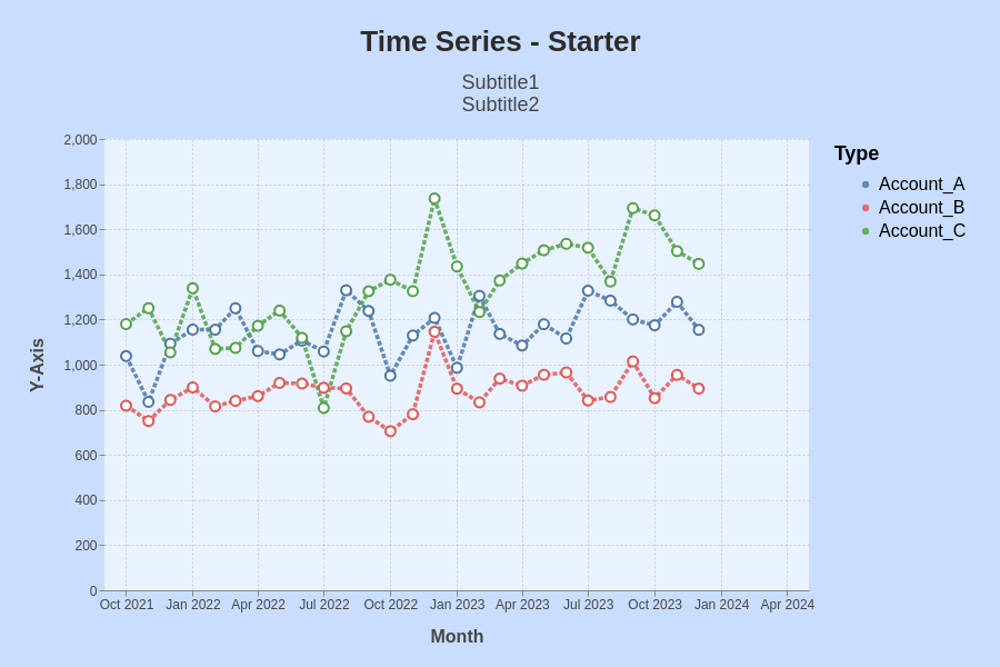
This is the result of the steps described below.

Time series with random data.
A standard use case in accounting are the values of accounts over time. You see here three accounts - A, B and C - with artificial data (incl. trend and Gaussian noise).
I had created the data shown here in a separate program and saved them to a file.
In the Altair story, you got the details to
- read data from a file into a dataframe
- create a graph using Altair
- create a theme in Altair
The example exists again of two steps:
- Reading into and wrangling the dataframe
- Using Altair to create a chart out of the dataframe
Only the steps specific to this example are detailed below.
Dataframe
Long Format (melt)
After reading the data into a dataframe, it needs to be converted from wide format to long format.
df = df.reset_index().melt(id_vars="Month", var_name="Type", value_name="Measurement")
Altair does not accept the index to be set, thus reset the index during this melt operation.
Altair
The chart is based on a theme such that all charts have the same background, grid line width or dash, etc..
Format the X-Axis for Month
You can choose among different formats. yearmonth, for instance, displays both year and month. The data must be in a suitable format, e.g. 2022-01-01. The axis can be scaled using a start date and an end date.
alt.X(
    'yearmonth(Month):T',
    title="Month",
    scale=alt.Scale(domain=(startDate, endDate)),
    ),
Format the Y-Axis
On the y-axis, most importantly you might set manually the scale and the number of ticks.
alt.Y('Measurement:Q',
        title="Y-Axis",
        axis=alt.Axis(tickCount=10),
        scale=alt.Scale(domain=(0, 2000)),
        ),
Format the Coloring
On the coloring, you might want to set the colors of your choice, e.g. you might want Account_A to be blue. You can enforce the sequence by sort.
alt.Color('Type:O', title="Type",
    sort=df.columns.values,
    scale={"range": [
        "blue"],
        "red"],
        "green"]
        ]
        },
    ),
The sorting is done along the columns of the dataframe.
Format the Lines, Points
Formatting of the lines is directly done as parameters of the mark_line command.
- You can set there the opacity level of the line, which softens the colors.
- You can change the line from solid to dashed.
- You can configure a point for the data.
mark_line(
    opacity=0.85,
    strokeDash=[4,2],
    point=alt.OverlayMarkDef(
        filled=False,
        size=80,
        fill='white',
        ),
Height and Width
Depending on the specific text for the chart, the title or subtitle often needs to be smaller or larger.
myChart = myChart.configure_title(
    fontSize=26,
    subtitleFontSize=18,
)
Issue noted: When a subtitle gets too long, the chart is not shown. This can happen for automatically generated subtitles.